LATEST
The Brand Identity Manual provides the rules applying to the visual identity system of Trinity College, Kandy. It is the grammar which applies to the logo (the College Crest), typeface, colours and structure of the space. However, those rules should not stop further improvements, well considered changes and creative experimentation.
It is important to consider that certain elements of Trinity's brand identity will be ‘learned’ by the consumer over time and more strongly identified with the brand than others. Those elements should never be changed while other details can be re-assessed over time in relation to their visual success and functionality.
This Brand Identity Manual is exclusively published on the official website of Trinity College, Kandy. You should always use the colour references indicated in the manual and a Pantone Colour Formula Guide to check colours for accuracy. The Brand Identity Manual establishes rules covering a large part of the production. On the other hand, it recommends but does not impose the use of specific equipment (signage, collateral material, etc.). In many cases the manual shows different options or imaginary situations whose aim is to help and inspire you in the creation of the relevant material.
It is strongly advised that all designers should follow the guidelines mentioned on this page when creating graphics to be published on the Trinity College website and its Social Media handles.
Inquiries can be made to the College Web Content Team by emailing website@trinitycollege.lk.
We advice not to print this page as it is made to view digitally.
The Visual Identity System for the College was derived by the core value of Trinity to evolve with times, while honoring its roots.
To align with this value, the visual identity is built as a blend between traditional and contemporary (the old and new).
Trinity Crest and other insignia are now copyright material and are prohibited to be used in material unrelated to Trinity College Kandy. All approved uses also includes royalty payments. Hence, without expressed permission you are kindly requested to refrain from illegal use of Trinity College branding properties
The logo is the most important aspect of Trinity's brand identity. It is also the starting point for a complex system of regulations and distinctive variations. As it is important to follow those rules to achieve consistency it is also important to apply the logo sensibly and with a certain creative intelligence.
It is essential that the trinity college crest (logo) is used correctly and consistently in all forms of communication. It should never be redrawn, modified or enclosed in a box or frame (unless specified in this manual). The logo should only be reproduced in the authorised colour palette in its positive or negative form.
Please note:
Two variations of the logo have been designed, the standard version (shown on this page) and the alternative version (shown in the Secondary Logo tab above) which consists of the addition of “Trinity College”


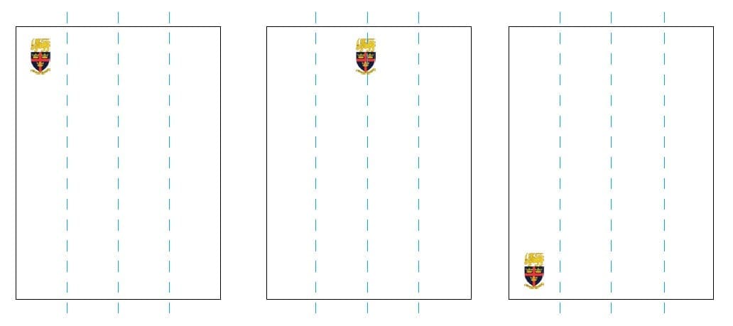
The exact construction of the logo is anintegral part of its design. The logo is designed onthe basis of visual criteria and equal proportions. The space around the logo is equally important as the logo itself. Whenever words or designs appear near the logo, a freezone should be considered around it. Nothing can be put here, neither texts nor drawings or photographs. Keeping an amount of space around the logo not only enhances its appearance, the freezone also helps to position the logo correctly on a format.
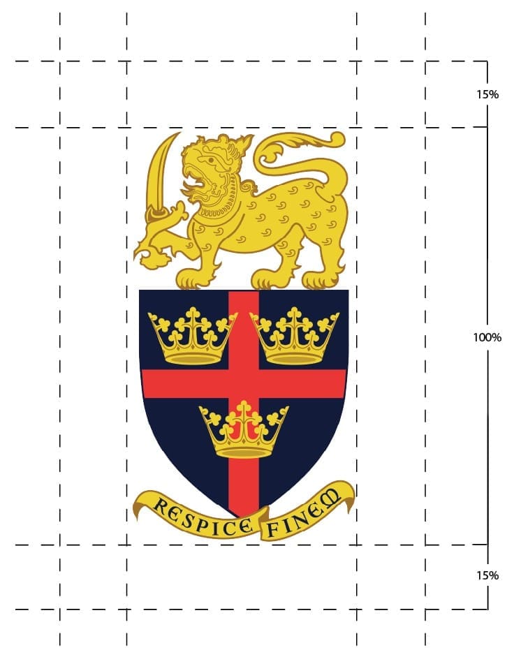

MINIMUM SPACE / FREE SPACE
The space around the logo is equally important as the logo itself. Whenever words or designs appear near the logo, a freezone should be considered around it. Nothing can be put here, neither texts nor drawings or photographs. Keeping an amount of space around the logo not only enhances its appearance, the freezone also helps to position the logo correctly on a format.

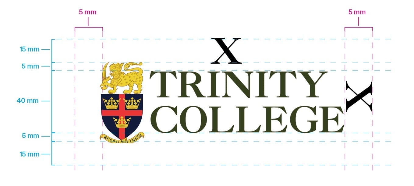
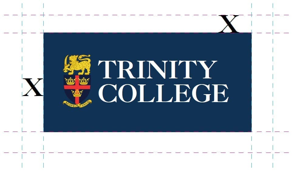
Sometimes, the logo can be used with colour blocks.

Use the X-Height of the Woordmark to distinguish margins.
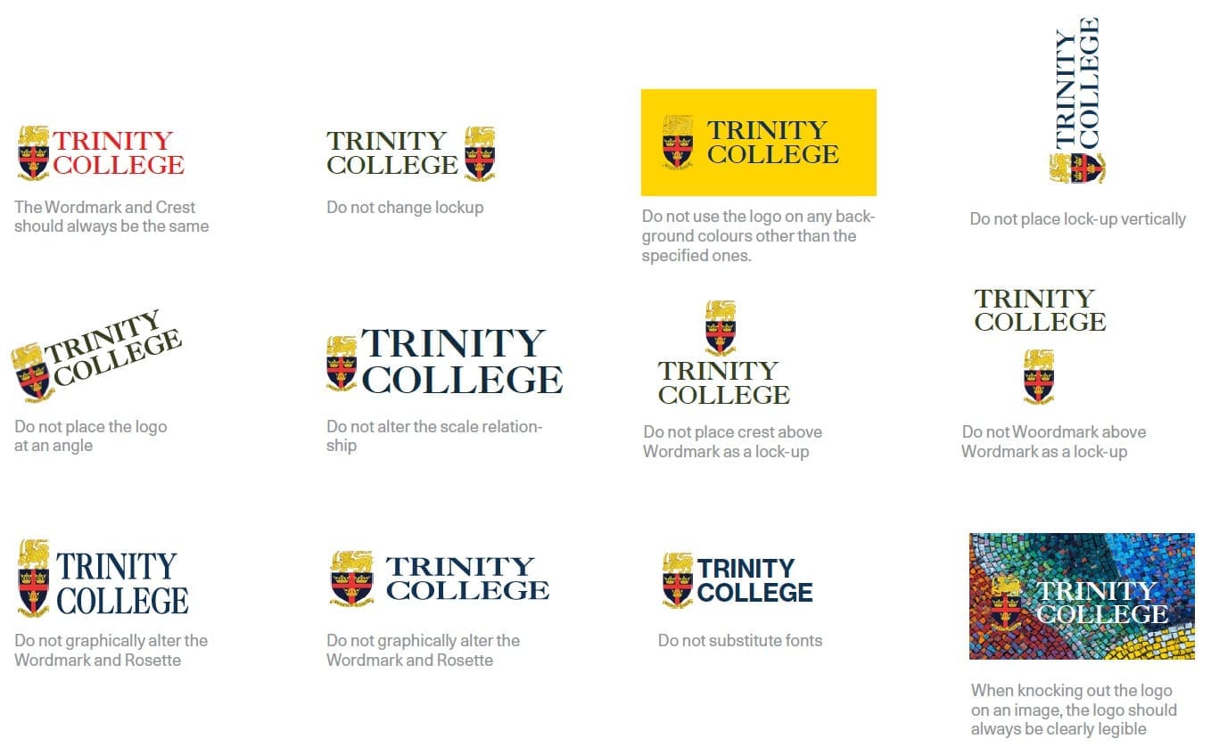
Improper Use of the Logo
To maintain consistency, please mind the following rules.
Colours are an important part of the Trinity identity.
In this sections you will find multiple coloured palettes, all derived from Trinity core colour palette.
Each palette can be used according to mood and occasion. This booklet will advice and direct you in the right path when picking a colour combination, but will not establish concrete rules. The responsibility of making sensible colour choices is up to each individual. When printing A hundred percent match can not always be achieved but every effort should be made to reproduce the intended colours as close to the specified as possible. The guidelines in this section should always be read before printing.
The following is the primary colour palette. The colour combinations were selected based on legibility as well as aesthetic appeal.
#000000
R 0 G0 B 0
Pantone Black 6 C
#d82629
R 216 G38 B 41
Pantone 485 C
#103355
R 16 G51 B 85
Pantone 534 C
#8d7237
R 141 G114 B 55
Pantone 7559 C
#dac79d
R 218 G199 B 157
Pantone 5875 C
#f2ece0
R 242 G236 B 224
Pantone 7499 C
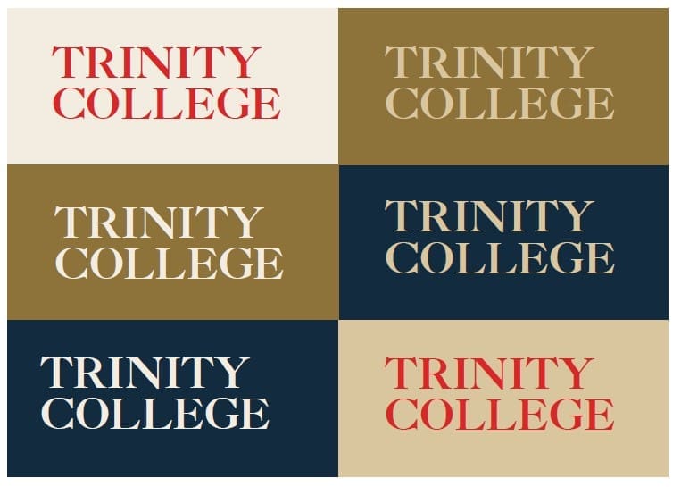
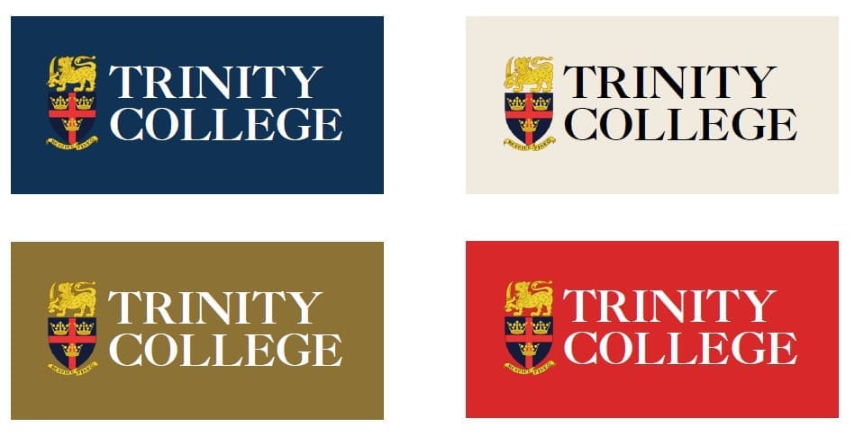
Secondary Logo on top of Colour Blocks deriving from the Standard Colour Palette.
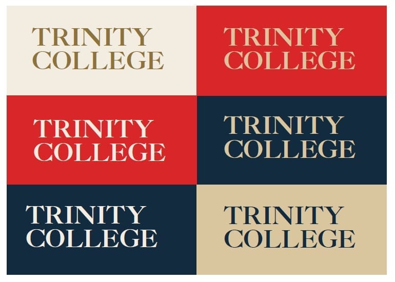
Based on the primary colour palette another colour combination was extracted, the following is less intense, but still maintains a certain level of contrast.
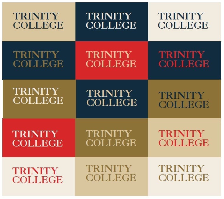
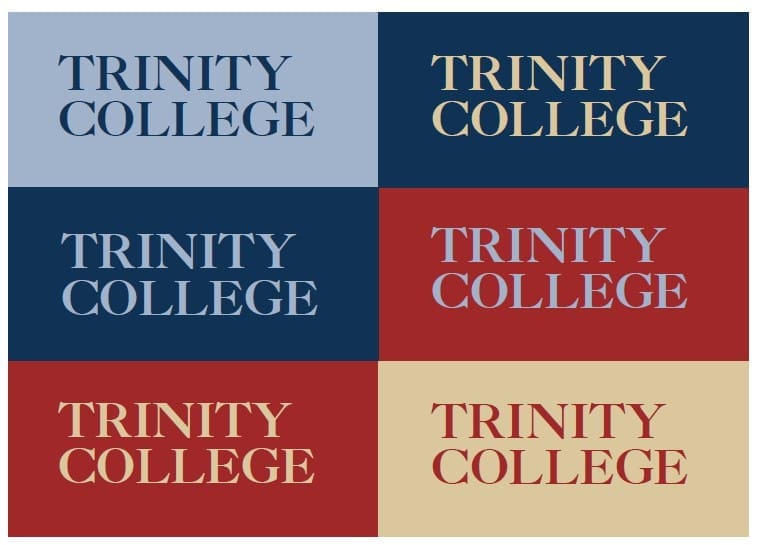
An overview of all possible colour combinations from the primary colour palette. It is advised not to go beyond the given combinations as these were selected bearing in mind the visibility of the text and colour.
Usages: Depending on the scope Colour blocks can be used to contain the Logo.
Usages: With Imagery, a white colour block can be used behind the Logo, to improve legibility and contrast.

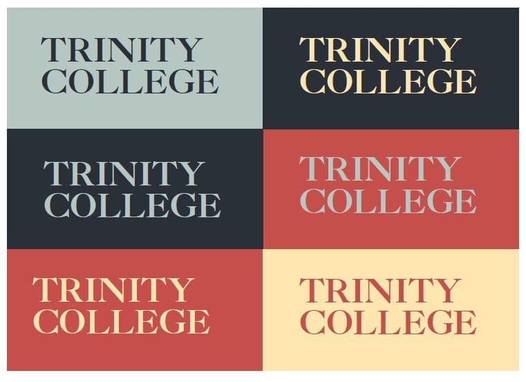
A flexible colour palette, that suits various occasions.
#c54f4b
R 197 G79 B 75
Pantone 180 C
#ffe6b0
R 255 G230 B 176
Pantone 7401 C
#293038
R 41 G48 B 56
Pantone 567 C
#b6c7c2
R 182 G199 B 194
Pantone 5513 C
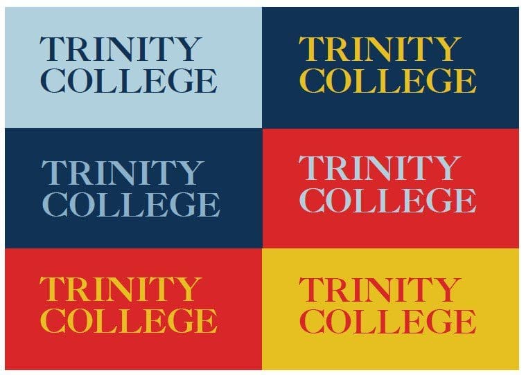
A colour palette, that is true to the Trinity colours. In practicality this could be used when your target audience are Alumni.
#d82629
R 216 G38 B 41
Pantone 485 C
#e6c020
R 230 G192 B 32
Pantone 604 C
#103355
R 16 G51 B 85
Pantone 534 C
#b0d0dd
R 176 G208 B 221
Pantone 552 C
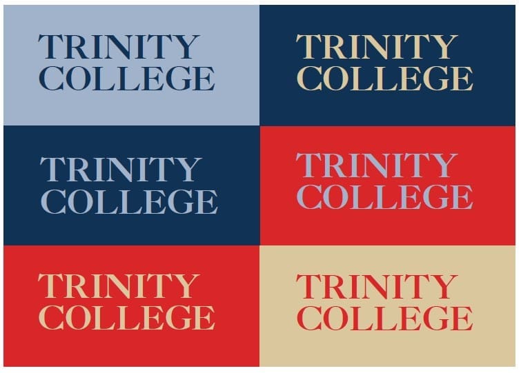
A colour palette, that is more experimental and cool toned. With the correct usage of imagery and secondary elements it can used for innovative occasions.
#d82729
R 216 G39 B 41
Pantone 485 C
#dac79d
R 218 G199 B 157
Pantone 5875 C
#103355
R 16 G51 B 85
Pantone 534 C
#a2b2cb
R 162 G178 B 203
Pantone 536 C
This dark toned colour palette is ideal when there is a need to address more serious occasions.
#a22829
R 162 G40 B 41
Pantone 484 C
#dac79d
R 218 G199 B 157
Pantone 5875 C
#103355
R 16 G51 B 85
Pantone 534 C
#a2b2cb
R 162 G178 B 203
Pantone 536 C
The Trinity identity is very simple and clean which makes a high attention to detail in the typography even more important. The level of accuracy should not only be applied to all printed material but also in day to day business.
Good typography is not only important for the overall impression of the brand identity, it also reflects on the quality of College Media Material and the consistency of the Trinity Brand.
ABCDEFGHIJKLMNOPQRSTUVWYZ
abcdefghijklmnopqrstuvwyz
1 2 3 4 5 6 7 8 9
ABCDEFGHIJKLMNOPQRSTUVWYZ
abcdefghijklmnopqrstuvwyz
1 2 3 4 5 6 7 8 9
ABCDEFGHIJKLMNOPQRSTUVWYZ
abcdefghijklmnopqrstuvwyz
1 2 3 4 5 6 7 8 9
ABCDEFGHIJKLMNOPQRSTUVWYZ
abcdefghijklmnopqrstuvwyz
1 2 3 4 5 6 7 8 9
ABCDEFGHIJKLMNOPQRSTUVWYZ
1 2 3 4 5 6 7 8 9
ABCDEFGHIJKLMNOPQRSTUVWYZ
abcdefghijklmnopqrstuvwyz
1 2 3 4 5 6 7 8 9
ABCDEFGHIJKLMNOPQRSTUVWYZ
abcdefghijklmnopqrstuvwyz
1 2 3 4 5 6 7 8 9
ABCDEFGHIJKLMNOPQRSTUVWYZ
abcdefghijklmnopqrstuvwyz
1 2 3 4 5 6 7 8 9
ABCDEFGHIJKLMNOPQRSTUVWYZ
abcdefghijklmnopqrstuvwyz
1 2 3 4 5 6 7 8 9
ABCDEFGHIJKLMNOPQRSTUVWYZ
abcdefghijklmnopqrstuvwyz
1 2 3 4 5 6 7 8 9
ABCDEFGHIJKLMNOPQRSTUVWYZ
abcdefghijklmnopqrstuvwyz
1 2 3 4 5 6 7 8 9
ABCDEFGHIJKLMNOPQRSTUVWYZ
abcdefghijklmnopqrstuvwyz
1 2 3 4 5 6 7 8 9
Aa Bb Cc Dd Ee Ff Gg Hh Ii
Jj Kk Ll Mm Nn Oo Pp Qq
Rr Ss Tt Uu Vv Ww Yy Zz
Regular 48pt
A B C D E F G H I J K L M N O
P Q R S T U V W Y Z
1 2 3 4 5 6 7 8 9
Bold 48pt
A B C D E F G H I J K L M N O
P Q R S T U V W Y Z
1 2 3 4 5 6 7 8 9
Regular 48pt
A B C D E F G H I J K L M N O
P Q R S T U V W Y Z
1 2 3 4 5 6 7 8 9
Regular, Italic 48pt
Aa Bb Cc Dd Ee Ff Gg Hh Ii
Jj Kk Ll Mm Nn Oo Pp Qq
Rr Ss Tt Uu Vv Ww Yy Zz
Regular 48pt
A B C D E F G H I J K L M N O
P Q R S T U V W Y Z
1 2 3 4 5 6 7 8 9
Bold 48pt
Aa Bb Cc Dd Ee Ff Gg Hh Ii
Jj Kk Ll Mm Nn Oo Pp Qq
Rr Ss Tt Uu Vv Ww Yy Zz
Regular 48pt
A B C D E F G H I J K L M N O
P Q R S T U V W Y Z
1 2 3 4 5 6 7 8 9
Bold 48pt
වන වගන්තිය ජාති,
වංශ, වර්ණ, ස්ත්රී
පුරුෂ භාවය, භාෂාව,
ආගම්, දේශපාාලන
Regular 48pt
அவர்கள்
மதிப்பிலும்,
உரிமைக ளிலும்
சமமானவர்கள்,
Regular 48pt
The name Trinity College, Kandy, including the style, logo, or any other content associated with the College's identity or image, should not be used for any unauthorised purpose, and you must obtain the express consent of the College Executive Council before posting any media content that bears the name of the College, or its logo and colors, on all Social Media Platforms.
We have restricted this page to only appear on large screens (desktops / PCs) due to the large media files & elements on display.
Kindly view this page on a PC or a Laptop screen. (www.trinitycollege.lk/identity)
Thank you.